

Next: Activity Measures
Up: Detailed Analysis of a
Previous: Population Size and Diversity
The two measures used to track evolution of the programs along the
A-fidelity axis were: the flaw period of individual programs, and
the proportion of the total number of offspring produced by an
individual that were unfaithful (less than 100% accurate).
The corresponding graphs are shown in
Figures 5.6 and 5.11
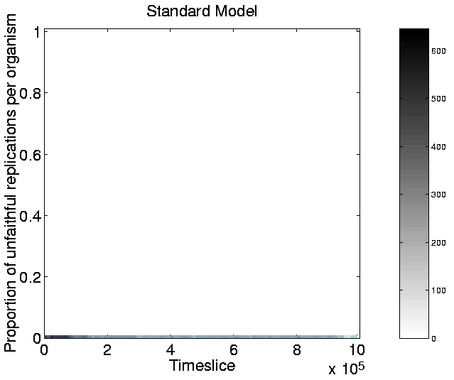
respectively. In the graph of unfaithful replications
(Figure 5.11), the vast majority of the points lie
at zero, indicating that nearly all programs which reproduced did so
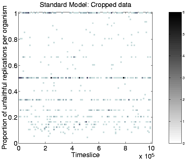
faithfully. In order to see whether there was any trend for programs
which did not always reproduce faithfully, the data from
Figure 5.11 is reproduced in
Figure 5.12 with the exception that points
lying at zero infidelity have been omitted. The bar on the right of
these two figures shows the scale (i.e. the mapping between the
darkness of the plot at any point in the graph and the number of
programs which had that particular infidelity at that particular
time). Note that the scale in Figure 5.12 is
two orders of magnitude smaller than in
Figure 5.11.
Figure:
Standard Run:
Unfaithful Replications.

|
Figure:
Standard Run:
Unfaithful Replications (omitting points with zero infidelity).
 |
It is clear from these graphs that there was little change in either of
these measures throughout the run. In other words, the programs are
not evolving along the A-fidelity axis. From the analysis in the
previous sections, it would appear that the parameter choices for this run
create a selection pressure that predominantly favours evolution along
the longevity and fecundity axes.


Next: Activity Measures
Up: Detailed Analysis of a
Previous: Population Size and Diversity
Tim Taylor
1999-05-29
